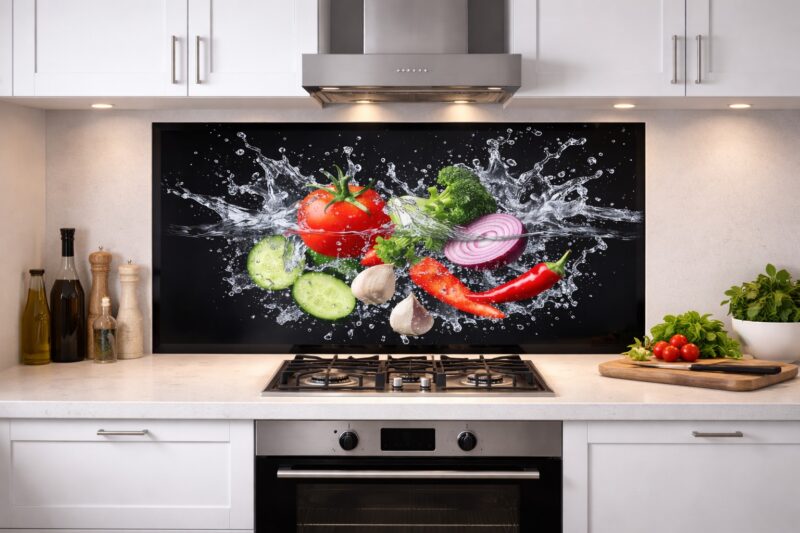
Food and drink printed splashbacks are a creative way to inject personality into a kitchen. From vibrant fruit images to coffee themed graphics and wine inspired artwork, these designs can add warmth and character to cooking spaces. When choosing glass splashbacks with food and drink prints, placement and scale are key to achieving a stylish result rather than an overwhelming one.
Why Choose Food And Drink Prints
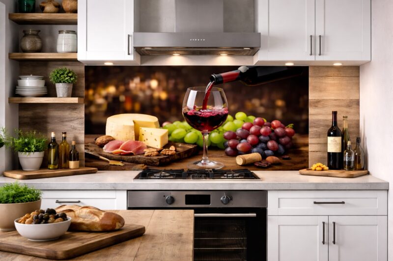
Food themed designs naturally connect to the purpose of the kitchen. Images of fresh ingredients, herbs, spices, coffee beans, or wine bottles can reinforce the culinary atmosphere and create a welcoming environment.
Printed glass splashbacks offer a practical advantage as well. The image is printed on the reverse side of toughened glass, protecting it from moisture, heat, and cleaning products. This means you can enjoy a bold design without sacrificing durability or hygiene.
However, food and drink prints tend to be more visually expressive than neutral or abstract designs. Choosing the right style and colour balance ensures the splashback complements your cabinetry and worktops rather than competing with them.
Best Placement Areas In The Kitchen
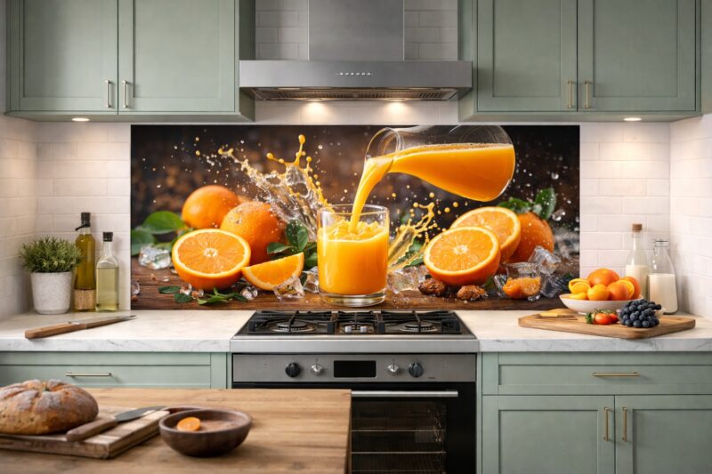
Food and drink printed splashbacks work best in areas where they can act as a feature rather than covering every wall. A common placement is behind a cooktop or along a single preparation wall. This creates a focal point while keeping the rest of the kitchen visually calm.
They are also effective in smaller zones such as coffee stations, breakfast nooks, or bar areas. For example, a coffee themed print can add charm to a dedicated beverage corner without overwhelming the main kitchen layout.
In open plan kitchens, consider how the design will look from adjacent living or dining areas. A large, highly detailed image may draw attention from across the room, so selecting a balanced composition is important.
Lighting also plays a role. Under cabinet lighting can highlight colours and textures within the image, enhancing depth and vibrancy.
Design Tips For A Lasting Look
To ensure longevity, avoid overly trend driven imagery or extremely saturated colours. Subtle photographic styles, muted tones, or artistic interpretations of food themes often age better than highly literal or cartoon like graphics.
Pay attention to scale. Large close up images of fruit or coffee beans can look dramatic, but they must be high resolution to maintain clarity. Request a print proof before production to confirm cropping and placement, especially around power point cutouts.
Coordinate colours within the print to your kitchen palette. If cabinets are neutral, a splash of colour can work beautifully. If cabinetry is bold, consider a softer, more monochrome image.
Conclusion
Food and drink printed splashbacks can add warmth, personality, and creativity to a kitchen when placed thoughtfully. By selecting high quality glass splashbacks, choosing balanced imagery, and limiting placement to key feature areas, you can create a stylish focal point that enhances the overall design without overwhelming the space.